DIG INTO THE DATA

Did it all disappear... what remains of certified compostable food packaging after composting?

With the Compostable Field Testing Program's Results Dashboard, you can navigate the real-world results for what residuals remain after composting for over 80 compostable products in field tests across a variety of compost technologies.

How to use the Dashboard

Select your filters in the dashboard below and the graph automatically updates!

Scroll further on this page for definitions and tips to interpret the results. 
To see and interact with the Dashboard, your display must be 1280 pixels wide or larger 
Viewing from a desktop computer is recommended

CFTP RESULTS


DASHBOARD TERMS + DEFINITIONS

The DISPLAY OPTIONS adjust what data is displayed, and how. The title of the chart and labels for X- and Y-axes will change based on your selections. 

The ITEM FILTERS and OPERATIONS FILTERS change what data is displayed, based on your selection.  

DISPLAY OPTIONS

Test Method

There are two distinct methods for field testing: (1) containing test items with feedstock in a "mesh bag", (2) items loosely "dosed" into the feedstock. Mesh bag testing is more prevalent. Both methods have advantages and disadvantages. See more on this in our FAQ.

Mass or Surface Area

When assessing residuals after a field test, you can calculate how much an item has broken down by wet weight, dry weight and surface area. The dashboard currently displays wet and dry weights together. Weight tends to be more conservative. Some trials only have weight data available. 

X-Axis Display

There are several ways to dig down into the data by changing how the data is displayed and the accompanying x-axis labels. Experiment with the different options to see what they show, and read the filter descriptions below for more context. 

Show by %...

The percent an item has broken down can be shown by how much is left (% residuals remaining ) or by how much broke down (% disintegrated). For residuals remaining, lower numbers indicate more breakdown. For percent disintegrated, higher numbers mean more breakdown.

ITEM FILTERS

Generic Material

See the data by broad material categories, dividing the high-level materials (biopolymer, fiber) into their basic formats, e.g., rigid biopolymer vs. not, lined vs. unlined fiber.

Specific Material

See more granular material categories, sub-types of the generic materials like specific biopolymers (PHA, PLA), fibers (Bamboo vs Paper), etc. 

Item Type

The format of test items, regardless of material, e.g., cup, bowl, cutlery. Note that if you select the 'Item Type' display and use the 'Item Type' filter, you will see different materials grouped for one item type, such as lined and unlined fiber for bowls. 

Item Brand

Filter by the brand to compare performance of similar items or materials from different manufacturers. Any brand which has not provided permission for their data to be open-sourced has been anonymized. 

OPERATIONS FILTERS

Technology

The primary composting method used for active composting at a given facility which conducted the field tests, e.g. turned windrow, aerated static pile, agitated in-vessel.

Average Temp

Operating conditions are tracked during the field test. Data is grouped according to temperature ranges in increments of 10 degrees from 60°C (140°F) to 71°C (160°F).

Average % Moisture

Operating conditions are tracked during the field test. The percent moisture content, assessed in field a maximum of biweekly, is grouped according to ranges in increments of 5% from 30% to 65%.

Trial Duration

The field trials under the CFTP mirror the typical operating conditions of the facilities conducting testing. Durations vary from 30 days to over 75.


"NOT ENOUGH DATA" MESSAGE

A core commitment of the CFTP is to anonymize the data from facilities participating in the field tests and donating their data. The Operations Filters will not display data if there are insufficient trials to preserve anonymity. 


If your filter selections return an error message that there is not enough data, select more options.

THE DATA IS CAPPED AT 100% RESIDUALS 

When evaluating residuals after a field test, it's possible the weight or surface area will be higher than the original, intact item. An over-100% residuals remaining means an item either absorbed material, flattened, or was inseparable from detritus. Although this represents a source of error in the data, CFTP preserves these data points in the dashboard since they tell an important story about sources of variability and error in the data and test methods. 

No data points are excluded where final values exceed the starting values, but the data is automatically "capped" or limited to 100% residuals remaining, even if there is a greater than 100% value. To see the data without capping it, select the checkbox to Show results with over 100% residuals remaining:

Note that this will only work if you are showing results by
Percent Residuals Remaining, rather than by 
Percent Disintegration. The graph will not display a disintegration below 0%. 

UNDERSTANDING OUR BOX PLOTS


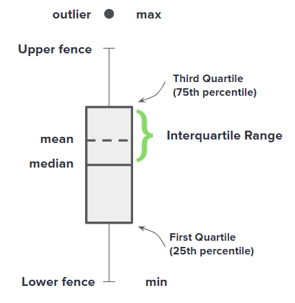
BOX PLOT LEGEND

A box-and-whisker plot, or box plot, is a simple way to display several qualities of a data set. It provides a summary of:

  • Max: Maximum value

  • Min: Minimum value

  • Median: Middle value

  • Mean: Average value

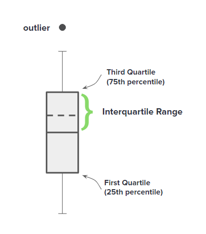
  • Outliers*: Data points that are significantly different from the rest of the data

  • First / Lower Quartile (q1): The bottom of the box; 25% of data falls below this

  • Third / Upper Quartile (q3): The top of the box; 75% of data falls below this

  • Upper fence: The value over which any additional data points are considered outliers.

  • Lower fence: The value under which any additional data points are considered outliers.

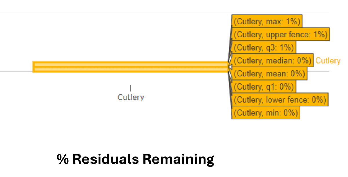
*Outliers are extreme values that stand out greatly from the overall pattern of values in a dataset or graph. A plot that shows only outliers (i.e., no box or whiskers are visible), or a small box and many outliers indicates that the data is clustered very tightly around the box. 


INTERPRETING A BOX PLOT

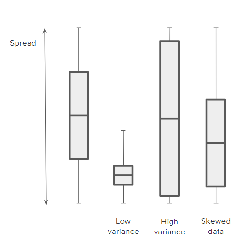
The size and location of the box in a box-and-whisker plot tells us important qualities of the data.

  • Dispersion / variability How spread out the data is; a longer box implies there is a large spread of data, a smaller box implies the data is concentrated within a smaller range

  • Distribution and skewness Skewness is a measure of the asymmetry of a distribution; whether the box is higher or lower in the total spread indicates where the data clusters


UNDERSTANDING OUTLIERS

Outliers are extreme values that stand out greatly from the overall pattern of values in a dataset or graph.

An outlier is an extremely high or extremely low data point relative to the nearest data point and the rest of the neighboring values in a dataset.

  • A chart showing only outliers, no box, indicates the data is clustered very tightly near the upper or lower limits of the chart.

  • A chart showing a very short box and outliers indicates the data is clustered very tightly around the values where the box is located.


NOTABLE DISTRIBUTIONS

The field test data shows diverse trends that vary by material and item type. A traditional box-and-whisker visual is not how most of the data looks; the box may be missing, scrunched, stretched, or there are many outliers.

Common distributions you may see include:

  • A box with no whiskers indicates that the vast majority of data falls within the range the box defines.

  • A box extending from 0 to 100 means the data is widely distributed across these values. 

  • A chart with only outliers indicates the data is clustered very tightly where the line is, which will be either at the maximum or minimum value. Mouse over the data to see whether the data is clustered around 0% or 100%.